What we know: We found a correlation between eating fish and people getting sick, but that isn’t really the root of the problem. We have also found that a number of tanks are below the average temperature that might cause issues with fish immune systems.
What we don’t know: We don’t actually know if rates of disease are present above average levels in the tanks, and we definitely don’t know what kinds of factors are contributing to this problem (if there is one!).
Our first challenge is that we can’t sample the disease rate in all tanks. It’s too expensive and takes too long. Instead of sampling all 1000 tanks, we’ve tasked our aquaculture scientists to take a sub-sample (50 tanks). Our aquaculture scientists have shared this data with us.
Let’s scope it out:
# Load tidyverselibrary(tidyverse)# Load datasick_fish <-read_csv("data/fish_sick_data.csv")# View first few rowshead(sick_fish)
Oh no, we might need to add a Fahrenheit column… let’s practice.
# Make temperature conversion functionc_to_f <-function(c =NULL){ f <- (c * (9/5)) +32return(f)}# Convert temperatures and put converted value in a new columnsick_fish <- sick_fish %>%mutate(avg_daily_tempF =c_to_f(avg_daily_temp))
Data Exploration
One of the best ways to get an idea of what our data look like and are telling us is by calculating some summary statistics.
Group Challenge
Let’s use the tidyverse to calculate some summary statistics for the data we have been given.
Write some code that produces the following values per species.
Mean (average) number of sick fish
Mean (average) percentage of sick fish per tank
How many tanks
sick_fish %>%group_by(species) %>%summarize(mean_sick =mean(num_sick), # mean number of fishmean_perc =mean(num_sick/num_fish), # mean percent of fishn =n()) # counts
# A tibble: 2 × 4
  species mean_sick mean_perc     n
  <chr>       <dbl>     <dbl> <int>
1 tilapia      3.39    0.0336    31
2 trout       14.7     0.193     19
Summary statistics (such as means) are helpful for giving us some ideas about our data, but they don’t tell us the full story. Plotting data can give us some additional insights.
Before we plot, let’s create two different data frames: one for tilapia and one for trout.
# New data frame for just tilapiasick_tilapia <- sick_fish %>%filter(species =="tilapia")# New data frame for just troutsick_trout <- sick_fish %>%filter(species =="trout")
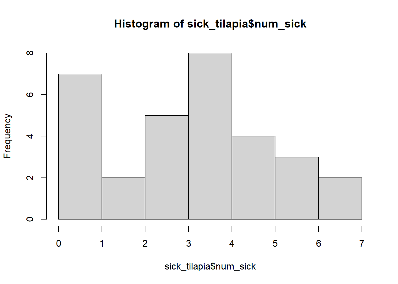
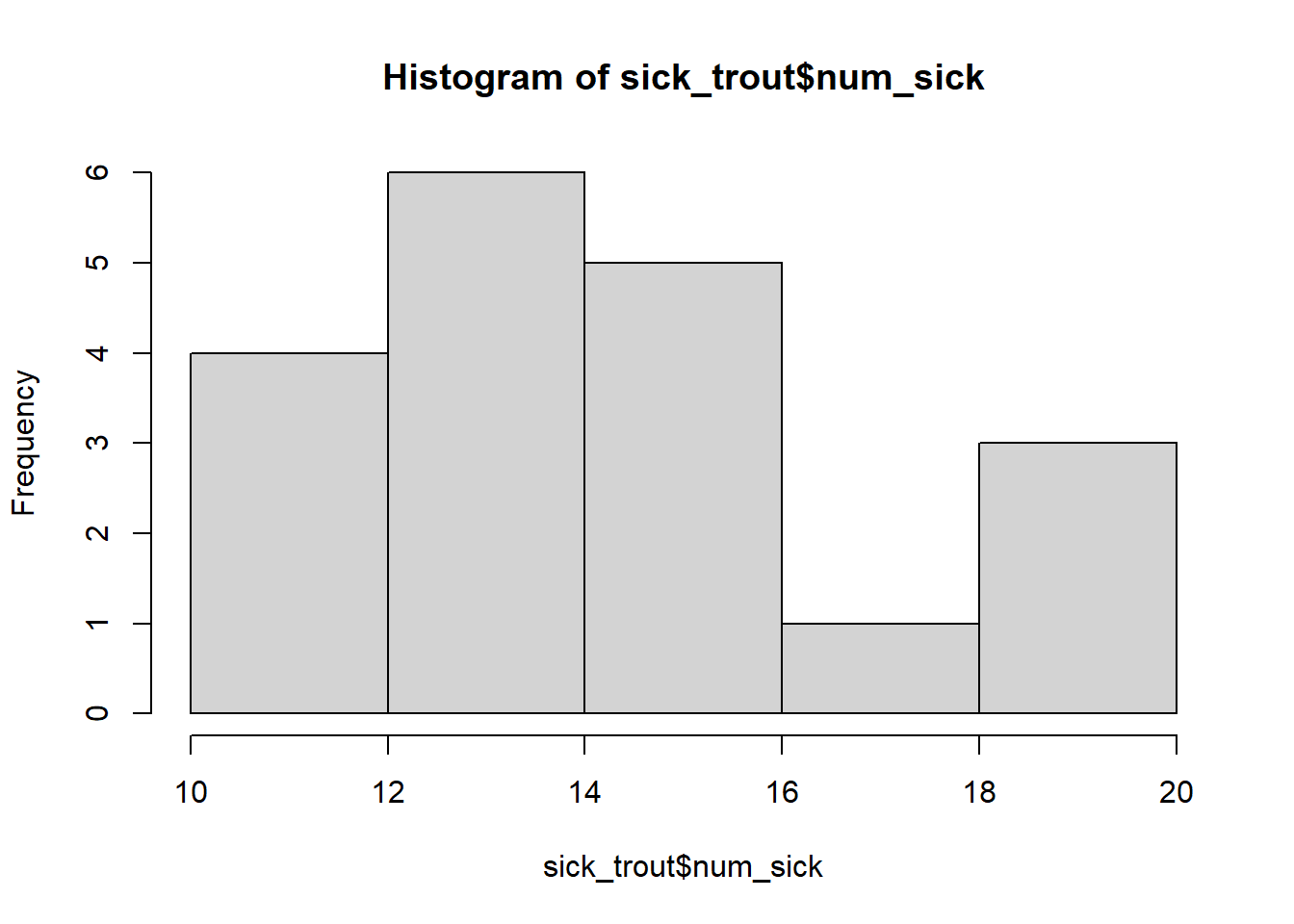
Now, let’s plot our data to get an idea of the distribution (spread) of the data. What might the distribution of the data tell us that an average can’t?
We can make histograms to see if there are some tanks that have a lot of sick fish and are increasing this average or if most of the tanks seem to have about the same number of sick fish.
Let’s compare values from tanks which are below the temperature cutoffs to those which are above the cutoffs to see if there are major difference or we can figure out some answers.
Using the if_else() function
Before we start calculating means and plotting, let’s create a new column in our data frame to indicate whether the tank temperature is above or below the cutoff temperature. We will use our fish-specific data frames to do this.
A useful function that we can use when we want to create a new column based on values in another column is the if_else() function. It operates the following way:
Practice using the if_else() function as we did above. This time, use the sick_trout dataframe. Remember to change the bits of the code that you need to!
# Modify the code below to do the same operation for the troutsick_tilapia %>%mutate(temp_cutoff =if_else(condition = avg_daily_tempF >=75,true ="above",false ="below"))
Another way we could write something like this is by using the if_else() function in something we call a for loop.
Before we do that, though, let’s talk through the general structure of a for loop. It essentially says for each value in a list, do a certain task. The “loop” is because we are “looping” through a list of values, performing the task for one value then looping back to the beginning to perform the task for the next value. We type the “task” within curly brackets, similar to a function that we write.
# for loop structure:# for ([value] in [list]){# Do the things I've written between the curly brackets# }# for loop example with yearsfor (year in2020:2022){print(paste("The year is", year))}
[1] "The year is 2020"
[1] "The year is 2021"
[1] "The year is 2022"
# What is happening in this loop?# We start with year = 2020,# So the for loop will print "The year is 2020"# We then go back to the beginning and do this again,# this time year = 2021# So now the for loop will print "The year is 2021"# The last value in our loop is year = 2022# And as you would expect, that would give "The year is 2022"
Now that we know the general structure of a for loop, we can combine it with the if_else() function to create a new column.
# Create an empty column in sick_tilapiasick_tilapia$temp_cutoff <-NA# What do we want to do?# for each value (i) in a list going from 1 to the number of rows in sick_tilapia,# put either "above" or "below" in the same place as (i) in the dataframe, but this time in the new column# In this case, i is equivalent to the row # So this loop will repeat however many rows are present in sick_tilapiafor (i in1:nrow(sick_tilapia)){ sick_tilapia$temp_cutoff[i] <-if_else(condition = sick_tilapia$avg_daily_tempF[i] >=75,true ="above",false ="below")}
Note: I will never ask you to write a for loop completely from scratch. I might have you copy and paste one or change some values in one, but you won’t have to write one out yourself.
Group Challenge
Try your hand at using the for loop we wrote above to create a new temperature cutoff column in the sick_trout data frame. Remember, the cutoff for trout was 59°F.
# New columnsick_trout$temp_cutoff <-NA# Same operation done on trout as done on tilapia abovefor (i in1:nrow(sick_trout)){ sick_trout$temp_cutoff[i] <-if_else(condition = sick_trout$avg_daily_tempF[i] >=59,true ="above",false ="below")}
Why for loops?
Like with our last lesson about functions, I’ve asked you to perform a task in a new and complicated way than you need to for that task. Why?
You’ll find some examples here in code written for my Ph.D. dissertation.
Back to Data Exploration
We now have 2 data frames, one with tilapia data and one with trout data. Each data frame also has a new column called temp_cutoff. On your own or with a partner, start exploring the data to figure out if there are differences between warm and cold tilapia and warm and cold trout.
Can you pinpoint an issue? Let’s start by comparing means.
# Mean number of sick tilapia per temperature cutoffsick_tilapia %>%group_by(temp_cutoff) %>%summarise(mean_sick =mean(num_sick))
# Alternative:# Put tilapia and trout data back togethersick_fish <-bind_rows(sick_tilapia, sick_trout)# Find mean number of sick fish for each species, for each temperature cutoffsick_fish %>%group_by(species, temp_cutoff) %>%summarise(mean_sick =mean(num_sick))
`summarise()` has grouped output by 'species'. You can override using the
`.groups` argument.
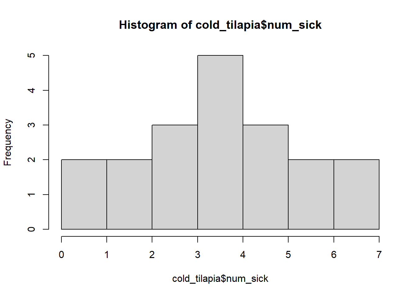
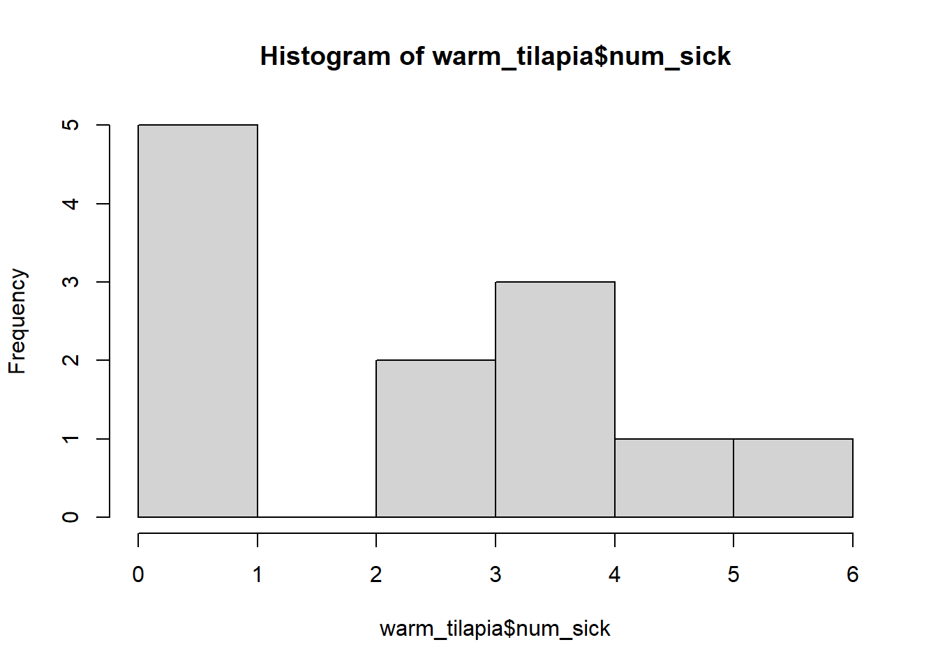
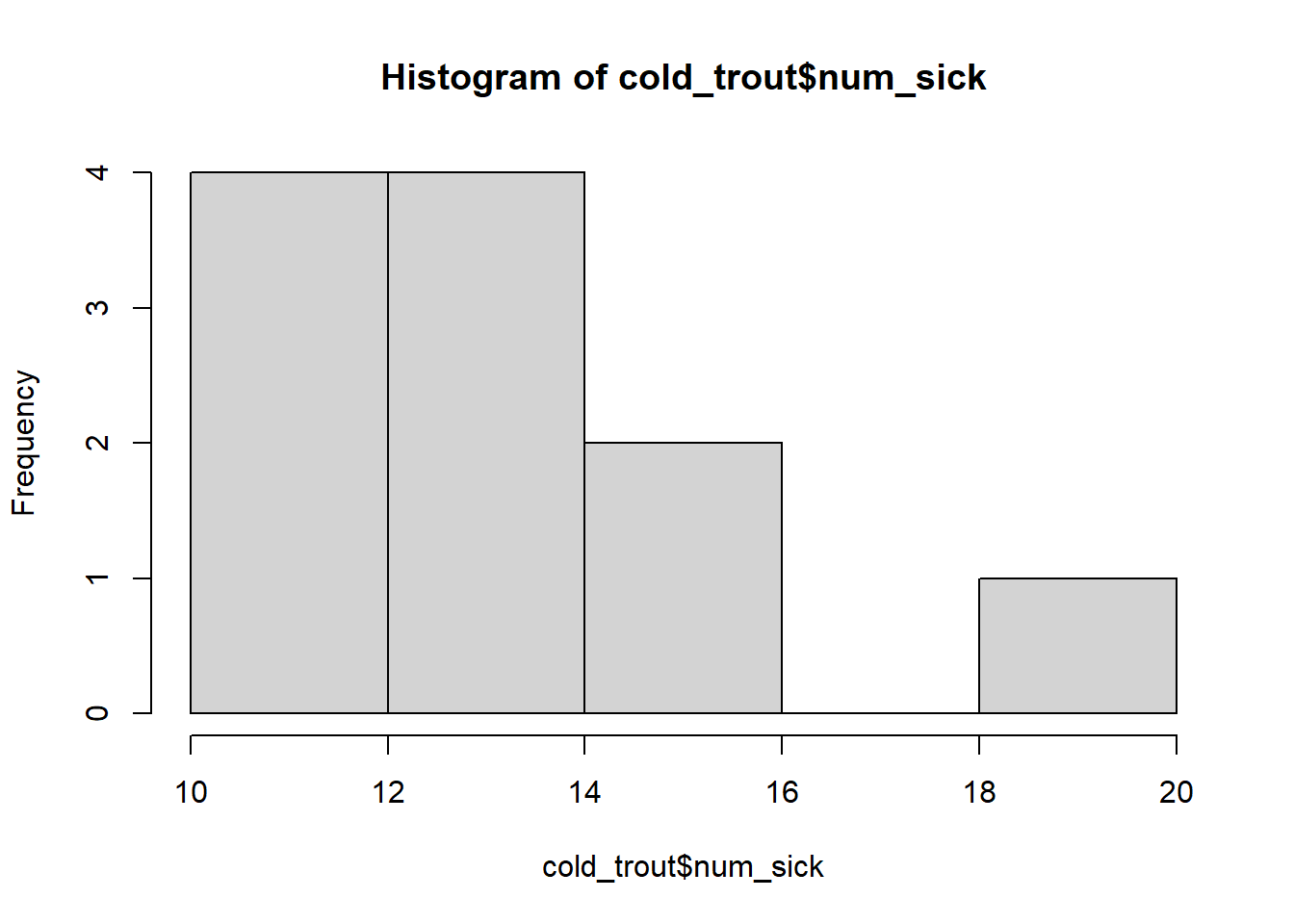
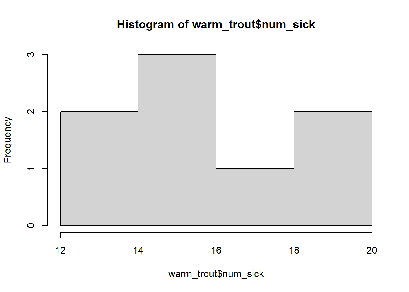
Not much popping out in the means. Next thing to check would be histograms of the number of sick fish for both species, above and below the cutoffs.
For now, I would recommend making 4 different data frames (this isn’t “best practice” but it is really helpful while you are learning).
# Separate tilapia below temperature cutoffcold_tilapia <- sick_tilapia %>%filter(temp_cutoff =="below")# Separate tilapia above temperature cutoffwarm_tilapia <- sick_tilapia %>%filter(temp_cutoff =="above")# Separate trout below temperature cutoffcold_trout <- sick_trout %>%filter(temp_cutoff =="below")# Separate trout above temperature cutoffwarm_trout <- sick_trout %>%filter(temp_cutoff =="above")# Tilapia histogramshist(cold_tilapia$num_sick)