# Load library
library(tidyverse)2.7: Wrap-Up
What is causing the food poisoning?
At the beginning of Module 2, we set out to discover what was causing food poisoning among our colleagues at our Antarctic base. Let’s put everything we’ve learned about descriptive statistics and data visualization to use to try to hunt down what the problem is.
Set-up
Let’s load the package and data we will need.
Packages
Data
First, we need our dataset!
# Load dataset
sick_fish <- read_csv("data/fish_sick_data.csv")
Let’s check out our data and remind ourselves what we are working with.
# View first few rows of data
head(sick_fish)
# A tibble: 6 × 7
tank_id species avg_daily_temp num_fish day_length tank_volume num_sick
<dbl> <chr> <dbl> <dbl> <dbl> <dbl> <dbl>
1 388 tilapia 24.3 93 10 399. 3
2 425 tilapia 24.6 98 11 400. 4
3 420 tilapia 23.0 103 9 399. 2
4 819 trout 14.1 85 11 401. 14
5 176 tilapia 23.3 98 10 400. 3
6 926 trout 13.8 79 12 400. 10Which Fish?
Last class, we plotted the number of sick fish. Let’s remind ourselves what that looked like. Make a plot that compares the numbers of sick fish per species. We actually have a few options!
# Density plot
ggplot(sick_fish, aes(num_sick, color = species)) +
  geom_density(alpha = 0.5) +
  labs(x = "Number of Sick Fish in Tanks",
       y = "Density",
       fill = "Species") +
  theme_classic()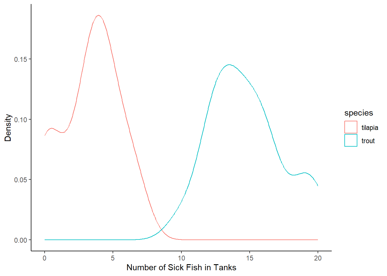
Density
Wait a second! Take a look back at the data. There is a “number of fish” column, indicating the total number of fish in the tank, and it looks like those numbers can differ pretty widely.
We should probably take into account how many fish there are in the tank to begin with. 12 sick fish out of 50 is probably a bigger deal than 12 sick fish out of 100!
What we need to do is calculate a density of fish — number of sick fish / number of total fish.
# Take into account the number of fish in the tank:
# Density of sick fish
sick_fish <- sick_fish %>%
  mutate(density = num_sick/num_fish)
Small Groups
Let’s make sure our conclusions about trout being the true culprits still hold when we account for the total number of fish in the tank.
Work in small groups to do the following:
- Find the average number and standard deviation of sick fish for both species
- Make a plot that compares the distributions of sick fish numbers for both species (you have multiple options here!)
# Mean and standard deviation of density of sick fish for each species
sick_fish %>%
  group_by(species) %>%
  summarize(mean_sick_fish = mean(density),
            sd_sick_fish = sd(density))
# A tibble: 2 × 3
species mean_sick_fish sd_sick_fish
<chr> <dbl> <dbl>
1 tilapia 0.0336 0.0207
2 trout 0.193 0.0327# Plot density sick fish for each species
ggplot(sick_fish, aes(species, density, color = species)) +
geom_boxplot() +
geom_jitter(alpha = 0.5, width = 0.1) +
labs(x = "Species",
y = "Density of Sick Fish in Tanks",
color = "Species") +
theme_light()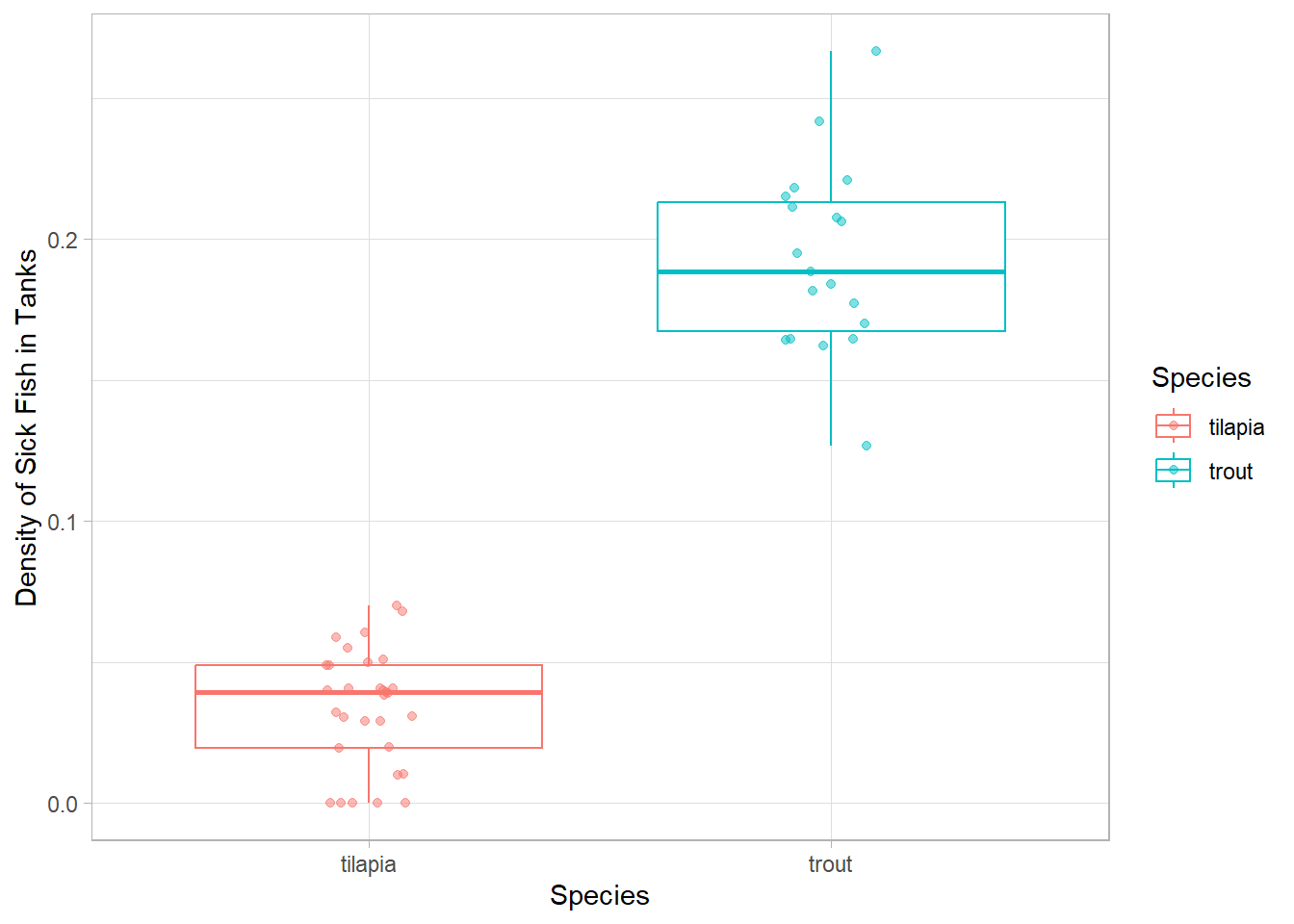
# And a histogram
ggplot(sick_fish, aes(density, fill = species)) +
  geom_histogram(alpha = 0.5, bins = 15)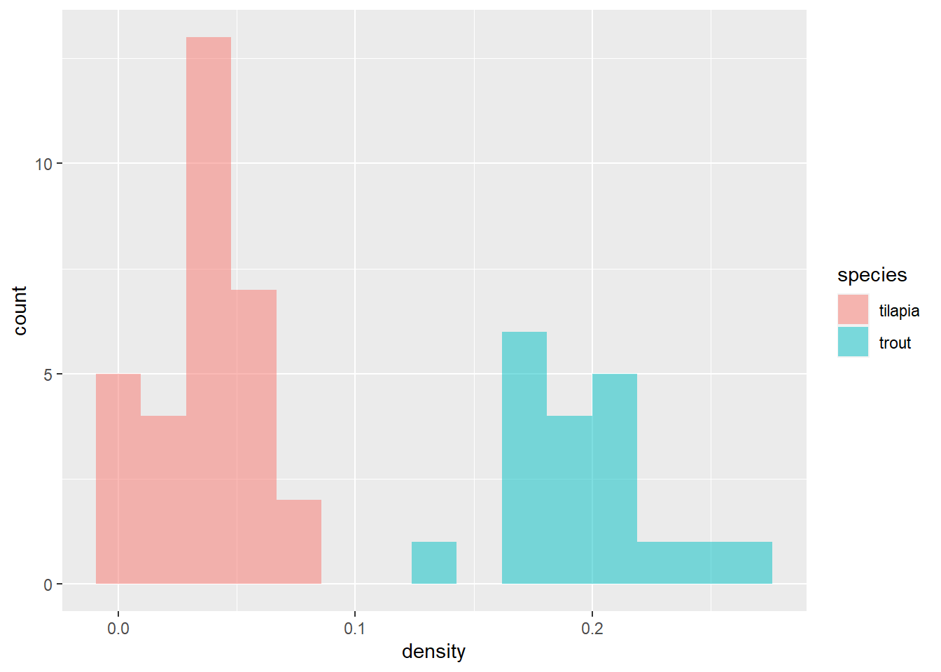
Uh oh…the trout densities look even worse than just the number of sick fish. We need to take a closer look at what is going on in the trout tanks!
We should create a data frame that only contains trout to work with for the rest of our analyses. Take a few minutes to work on that; call it sick_trout.
# Only trout
sick_trout <- sick_fish %>%
  filter(species == "trout")
What Environmental Factor?
Take a look back at the data frame. Which columns are environmental variables that could be driving the issues?
Are those columns continuous or categorical? What plot type have we talked about that might help us find a relationship between density and each of these variables (one at a time…)?
In small groups, make plots using density column in the sick_trout data to try to figure out which environmental factor is causing problems in the trout. Treat your variables as continuous.
# Is it the number of fish?
ggplot(sick_trout, aes(x = density, y = num_fish)) +
  #geom_smooth(method = 'lm', se = FALSE) +
geom_point() 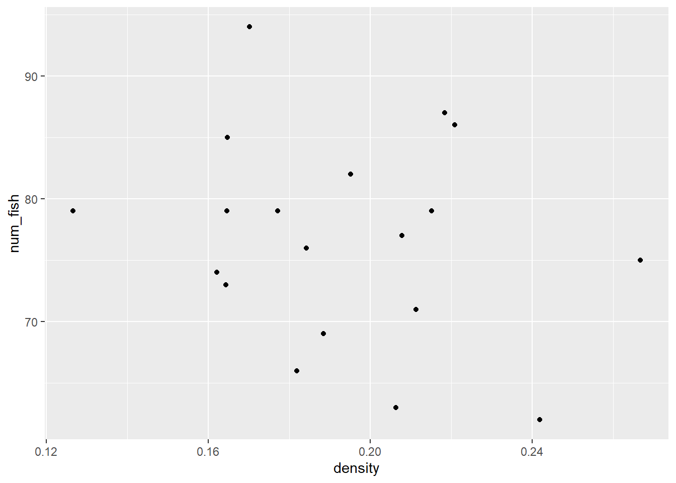
# Is it the average daily temperature?
ggplot(sick_trout, aes(x = density, y = avg_daily_temp)) +
  #geom_smooth(method = 'lm', se = FALSE) +
  geom_point()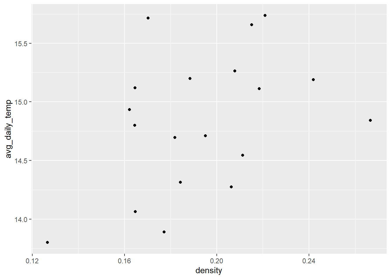
# Is it the day length?
ggplot(sick_trout, aes(density, day_length)) +
  #geom_smooth(method = 'lm', se = FALSE) +
geom_point() 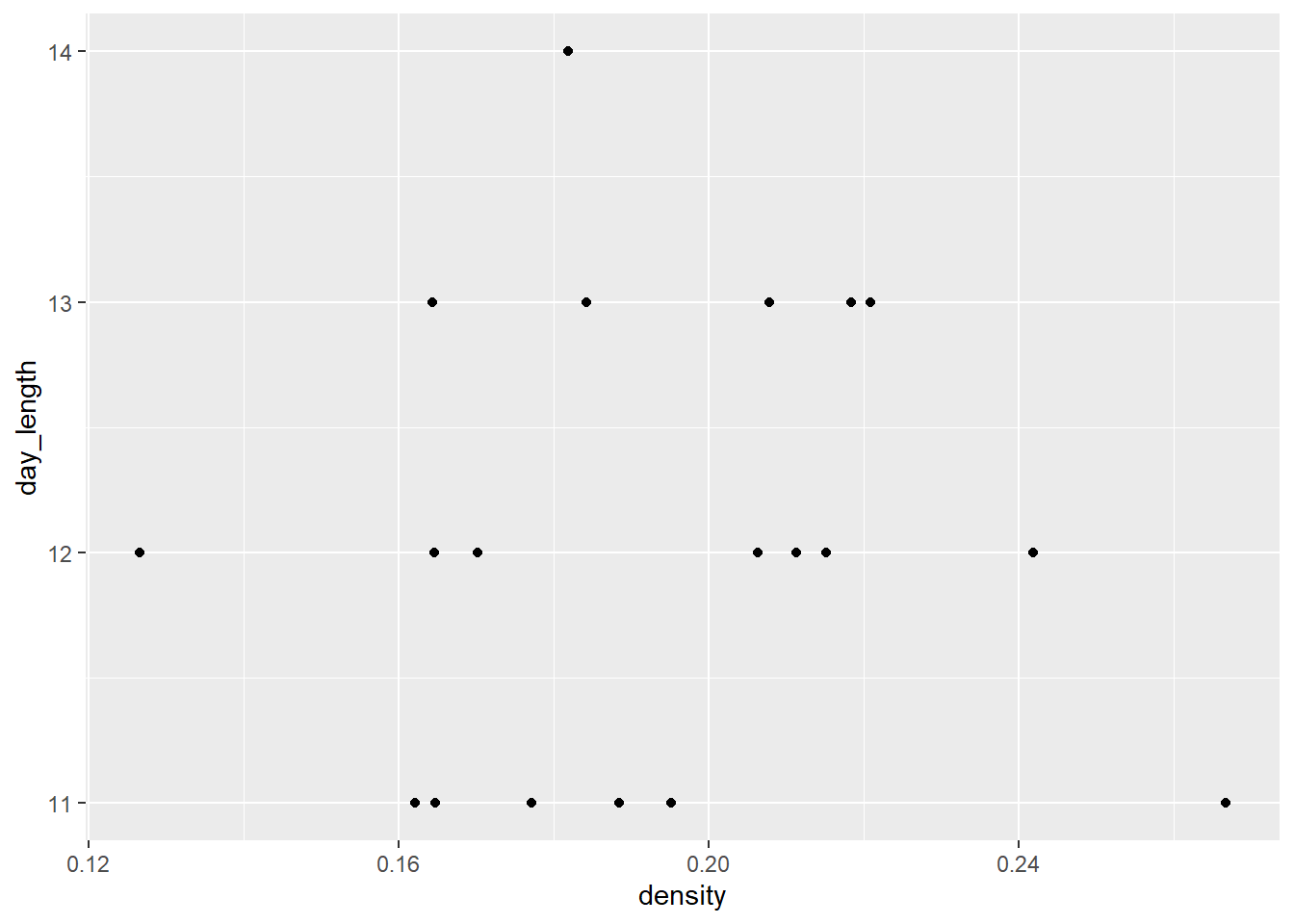
What do we think is the environmental driver causing issues with the trout?